LendingFront
Year
2023-2025
Role
UX & Visual Design Lead, Strategist, Researcher
Industry
Industry Fintech / Lending (B2B SaaS)
Main Tools
Figma · Adobe Xd · Adobe Suite · Maze · GA4 · Lucky Orange
Main Goal
Shorten the SMB-loan funnel and cut support costs by clarifying flows and unifying visuals across Marketplace & Customer Portal

Clients, Partners and Lenders struggle with fragmented navigation, disjointed loan flows, and inconsistent UI patterns, leading to drop-offs, longer underwriting cycles, and costly chat volume.

Key Insights
Stakeholder 1-1s: Underwriting leads begged for clearer status hand-offs → “Every extra email extends funding 1 day.”
Session replays (30): 72 % of users rage-clicked trying to find the next step.
Client interviews (8 moderated): Top pain: “Not sure what to do next and the mobile version is broken.”
Heuristic + WCAG audit: Main Violations: Visibility of system status, Consistency, Error prevention, Color contrast.
My contribution:
Strategy
Defined north-star OKR with Product & Growth.
Research
Ran borrower interviews, partner sessions and heuristic audits.
Design
Produced hi-fi frames, spec’d components, coded Figma tokens.
Collaboration
Guided 2 FE devs through design-system adoption; facilitated weekly design crits with Lenders’ PMO
Testing
Maze task flow + Attention Insight heatmaps (gear-icon nav won 76 % focus).
Solution Pillars
-
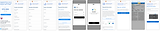
Marketplace Redesign – New dashboard, referral-partner tables, and add-partner flow with modern typography (Maven Pro → Poppins), color-coded statuses, and responsive layouts.
-
Client Portal Overhaul – Consolidated loan steps, progressive disclosures, and gear-icon navigation that tested best in Attention Insight heatmaps.
-
Design System Refresh – Tokenized colors, iconography library, and adaptive form elements to speed future feature work and keep Lender & Partner instances visually coherent.
-
Risk & Underwriting Visibility – Inline status chips + “Docs Needed” smart links, reducing back-and-forth emails.
-
Behavioral Nudges – Micro-copy tweaks (“one step left”) and contextual tooltips to keep SMB borrowers motivated.


CP- Quick Wins
-
Real-time dashboard with status chips & progress bars gives clients and lenders instant clarity on every loan stage.
-
Responsive multi-doc uploader + mobile-first layout (bottom-sheet nav, large tap targets) keeps flows smooth down to 320 px.
-
Min-to-max offer slider lets merchants fine-tune funding without typing numbers, cutting entry errors and drop-offs.
-
Inline status chips & MFA replace email ping-pong and add bank-level security.
-
Plain-language microcopy + WCAG-contrast refresh boosts comprehension for first-time SMB borrowers.
Design System Creation
To turn one-off fixes into a sustainable practice, I spearheaded Lender DS v1.0 a modular, token-based design system tailored to LendingFront’s fintech needs.
-
Foundation tokens: Color, type scale, spacing, and elevation were abstracted into Figma variables, giving engineers one source of truth for themeable values (light/dark, brand white-labeling).
-
Core components: Buttons, form inputs, data tables, and notification banners were rebuilt on a 4-pt grid with WCAG-AA contrast baked in. States (hover, focus, disabled) ship in every variant to eliminate “quick-fix” CSS overrides.
-
Documentation & governance: Each component lives in Storybook with usage guidelines, do-and-don’t examples, and React/Angular code snippets. A fortnightly “DS clinic” keeps adoption and contribution flowing across squads.
-
Impact: Early roll-out shaved 28 % off UI dev time for the dashboard revamp, cut QA visual bugs in half, and gave the product a shared language for faster decisions.

